IELTS Academic Writing Task 1
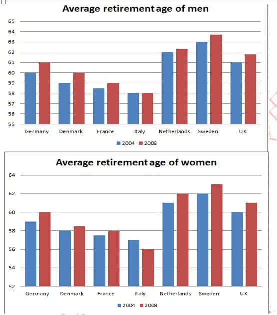
The graphs below show the average retirement age for men and women in 2004 and 2008 in six different countries.
Summarise the information by selecting and reporting the main features and make comparisons where relevant.
Things you should know about Academic Writing Task 1:
- You are asked to describe information presented in graph/ table/ chart/ diagram.
- You have 20 minutes to finish the task and you have to write at least 150 words.
- If you are asked to use the information presented in the graph you must be careful not to copy it.
In Academic Writing task 1, candidates are assessed on their ability to:
- Organise, present and possibly compare data.
- Describe the stages of a process or procedure.
- Describe an object or event or sequence of events.
- Explain how something works.
Model Answer :
The given column graphs compare the retirement age of males and females in six countries in 2004 and 2008. Overall, the retirement age increased in all countries with the exception of Italy, among men, and France, among women, where it remained the same in the given years.
The Danish men and women retired at the ages of 60 and 59 respectively in 2004, but in 2008 they both retired at the age of 61. The average age of retirement for both genders was the lowest in France, with the men retiring at the age of 58 in 2004 and at 59 in 2008. Women retired at the age of 58 in both the given years. The Italian men retired at 60 years in 2004 as well as 2008, whereas women retired at a younger age in both the years as compared to men. The age of retirement for women was 58 in 2004 and 59 in 2008. A similar trend in retirement ages was seen among the Dutch, Swede and British males and females with the increase of one year in each case in 2008 as compared to 2004.
To conclude, a striking feature of the graph is that the retirement age for both sexes was the highest in Sweden in comparison with all other given countries.
More Bar Graph:
- The graphs below show four categories of citrus fruits and the top three countries to which these were exported (in thousand tonnes) in 2012.
- The chart below gives information about the growth of urban population in certain parts of the world including the prediction of the future.
- The graph below shows the changes in the places where people used to surf the Internet in the years 1998, 2000, 2002 and 2004.
- The graph below shows the average class size in six countries and compares it with the world average class size in 2006.
- The chart below shows information about the favourite subjects of 60 students from two schools, school A and school B.


