IELTS Academic Writing Task 1
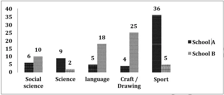
The chart below shows information about the favourite subjects of 60 students from two schools, school A and school B.
Summarize the information by selecting and reporting the main features, and make comparisons where relevant.
Things you should know about Academic Writing Task 1:
- You are asked to describe information presented in graph/ table/ chart/ diagram.
- You have 20 minutes to finish the task and you have to write at least 150 words.
- If you are asked to use the information presented in the graph you must be careful not to copy it.
In Academic Writing task 1, candidates are assessed on their ability to:
- Organise, present and possibly compare data.
- Describe the stages of a process or procedure.
- Describe an object or event or sequence of events.
- Explain how something works.
Model Answer :
The given column graph illustrates the best-loved subjects of 60 students from two schools, School A and School B. It is clear from the graph that the choice of subjects varies greatly between the two schools.
In school A, more than half the students (36) like sports. By contrast, the rest of the subjects are not very popular among students in school A.
In school B, 25 students like craft and drawing, which is more than six times the student’s number of school A. Language is the second most preferred subject in school B, chosen by 18 students. Social science is the third most-liked subject, with ten students of school B liking it, which is almost double the number of students of school A, who like it. Only two students from school B like science, whereas 9 of school A like science. The biggest discrepancy can be seen in those choosing sports as their favourite subject, with 36 students of school A going for sports, in contrast to only 5 of school B.
Overall, craft and drawing is the least preferred subject of school A students, whereas science is the least liked the subject of students of school B.
More Bar Graph:
- The graph below shows the information on waste disposal in a European country from 2005 to 2008.
- The chart below gives information about the growth of urban population in certain parts of the world including the prediction of the future.
- The graph below shows the changes in the places where people used to surf the Internet in the years 1998, 2000, 2002 and 2004.
- The graph below shows the average class size in six countries and compares it with the world average class size in 2006.
- The charts below show the number of working hours per week, in industrial sector, in four European countries in 2002.


