IELTS Academic Writing Task 1
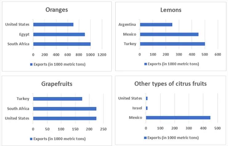
The graphs below show four categories of citrus fruits and the top three countries to which these were exported (in thousand tonnes) in 2012.
Summarise the information by selecting and reporting the main features and make comparisons where relevant.
Things you should know about Academic Writing Task 1:
- You are asked to describe information presented in graph/ table/ chart/ diagram.
- You have 20 minutes to finish the task and you have to write at least 150 words.
- If you are asked to use the information presented in the graph you must be careful not to copy it.
In Academic Writing task 1, candidates are assessed on their ability to:
- Organise, present and possibly compare data.
- Describe the stages of a process or procedure.
- Describe an object or event or sequence of events.
- Explain how something works.
Model Answer :
The given bar charts compare the top three countries importing different types of citrus fruits in 2012. The fruits given are oranges, lemons, grapefruits and all other citrus fruits.
As can be seen from the chart, oranges were the most popular fruit. More specifically, South Africa was the country where the largest number of oranges were exported amounting to 1020 thousand tonnes approximately. This was followed by Egypt (500 thousand tonnes) and the United States, which imported the smallest amount (400 million tonnes) of oranges among the three countries.
Lemon was the second popular fruit in the four categories, with 500,000 tonnes imported by Mexico and 200 imported by the USA. The minimum amount was imported by Argentina (100,000 tonnes).
Grapefruits did not constitute a large proportion of the imported fruit. Turkey was the main country that imported grapefruits, while Mexico and the United States imported 400,000 and 300,000 tonnes respectively.
The largest import of all other citrus fruits was done by Mexico. The other two countries only accounted for a tiny proportion of the whole volume.
Overall, the export quantities of different fruit varied among different countries in 2012.
More Bar Graph:
- The graph below shows the information on waste disposal in a European country from 2005 to 2008.
- The chart below gives information about the growth of urban population in certain parts of the world including the prediction of the future.
- The graph below shows the changes in the places where people used to surf the Internet in the years 1998, 2000, 2002 and 2004.
- The graph below shows the average class size in six countries and compares it with the world average class size in 2006.
- The chart below shows information about the favourite subjects of 60 students from two schools, school A and school B.


