IELTS Academic Writing Task 1
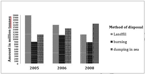
The graph below shows the information on waste disposal in a European country from 2005 to 2008.
Summarise the information making comparisons where relevant.
Things you should know about Academic Writing Task 1:
- You are asked to describe information presented in graph/ table/ chart/ diagram.
- You have 20 minutes to finish the task and you have to write at least 150 words.
- If you are asked to use the information presented in the graph you must be careful not to copy it.
In Academic Writing task 1, candidates are assessed on their ability to:
- Organise, present and possibly compare data.
- Describe the stages of a process or procedure.
- Describe an object or event or sequence of events.
- Explain how something works.
Model Answer :-
The given column graph illustrates three methods of disposal of waste materials in 2005, 2006 and 2008. It is clear that the landfill method was the most used for waste disposal in 2005 and dumping in sea was used the maximum in 2008.
It is clear that about 2000 million tonnes of waste was disposed by landfill method in 2005. Disposal of waste by this method lost popularity gradually and by 2008, only 1200 million tonnes was disposed off by this method. About 900 million tonnes of waste was burnt and about 1200 million tonnes was dumped in sea.
In 2006, again the most popular method of waste disposal was landfill, but the amount disposed was lesser than that in 2005. Just under 1200 million tonnes was disposed off by burning and a little over 1400 million tonnes was dumped in sea.
In 2008, the most popular method was dumping in sea and over 1600 million tonnes was disposed off like this. A little under 900 million tonnes was burnt.
Overall, it can be seen that dumping in landfill sites lost popularity and dumping in sea gained popularity in the given time. The burning method of waste disposal fluctuated over the period.
More Bar Graph:
- The chart below shows the percentage of adults of different age groups in the UK who used the Internet everyday from 2003-2006.
- The chart below shows the expenditure on three categories among different age groups of residents in the UK in 2004.
- The chart below shows the percentage of whole world population in four countries from 1950 to 2000, with projections till 2050.
- The chart below shows the aid from six developed countries to developing countries from 2008-2010.
- The charts below show the number of working hours per week, in industrial sector, in four European countries in 2002.


