IELTS Academic Writing Task 1
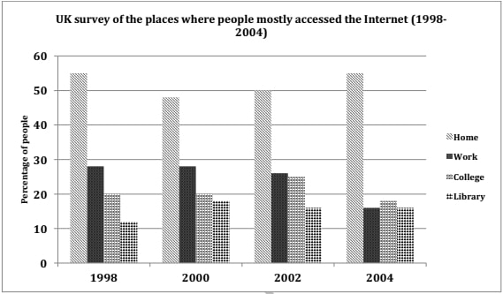
The graph below shows the changes in the places where people used to surf the Internet in the years 1998, 2000, 2002 and 2004.
Summaries the information by selecting and reporting the main features and make comparisons where relevant.
Things you should know about Academic Writing Task 1:
- You are asked to describe information presented in graph/ table/ chart/ diagram.
- You have 20 minutes to finish the task and you have to write at least 150 words.
- If you are asked to use the information presented in the graph you must be careful not to copy it.
In Academic Writing task 1, candidates are assessed on their ability to:
- Organise, present and possibly compare data.
- Describe the stages of a process or procedure.
- Describe an object or event or sequence of events.
- Explain how something works.
Model Answer :
The given column graph compares the changes in the places where people accessed the Internet between 1998 and 2004. The maximum people surfed the Internet from home in all the given years.
It can be seen from the graph that more people surfed the Internet at home and in their working places than in the colleges and libraries. The percentage of people who accessed the Internet from home fell from approximately 55 in 1998 to 48 in 2000. After that, this percentage began to rise steadily and reached 55 in 2004.
The second most common place where people accessed the net was the office. The proportion of people who spent their online time at work was between 25% and 30% from 1998 to 2002 but fell to 15% in 2004. Approximately 18%-25% of people used the Internet at college in all the given years. The least percentage surfed the net in libraries. This percentage fluctuated between 12% and 18% over the given years.
Overall, the discrepancy between people surfing the net from home and all other places was high in all the four given years.
More Bar Graph:
- The graph below shows the information on waste disposal in a European country from 2005 to 2008.
- The chart below gives information about the growth of urban population in certain parts of the world including the prediction of the future.
- The chart below shows the percentage of whole world population in four countries from 1950 to 2000, with projections till 2050.
- The chart below shows the aid from six developed countries to developing countries from 2008-2010.
- The charts below show the number of working hours per week, in industrial sector, in four European countries in 2002.


