IELTS Academic Writing Task 1
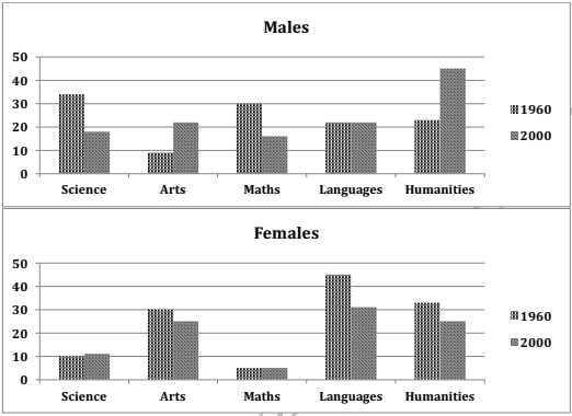
The charts below show the percentages of male and female students getting top grades in 1960 and 2000.
Summarise the information by selecting and reporting the main features and make comparisons where relevant.
Things you should know about Academic Writing Task 1:
- You are asked to describe information presented in graph/ table/ chart/ diagram.
- You have 20 minutes to finish the task and you have to write at least 150 words.
- If you are asked to use the information presented in the graph you must be careful not to copy it.
In Academic Writing task 1, candidates are assessed on their ability to:
- Organise, present and possibly compare data.
- Describe the stages of a process or procedure.
- Describe an object or event or sequence of events.
- Explain how something works.
Model Answer :
The given column graphs compare the proportion of boys and girls getting top grades in five subjects, which are science, arts, maths, languages and humanities, in 1960 and 2000. It is clear from the graph that girls scored higher in Arts and languages, whereas boys scored higher in science and math in the given years.
In 1960, slightly over 30% of boys scored good grades in science and maths, whereas in languages and humanities the high scorers were 20% each. Only one in ten scored high in Arts. In contrast, girls did much better in languages, arts and humanities, with 45%, 32% and 30% scoring high in these subjects respectively. Only 10% of girls scored high in science, and the least (5 %) scored high in maths.
In 2000, among boys, the percentage of top scorers in arts and humanities almost doubled whereas in science and math became approximately half as compared to the figures of 1960. The percentage of top scorers in languages remained the same. Among girls, however, the percentage of top scorers in arts, languages and humanities decreased moderately, whereas in science and maths remained the same.
Overall, it is surprising to see that boys scored better than girls in humanities in the year 2000.
More Bar Graph:
- The graph below shows the information on waste disposal in a European country from 2005 to 2008.
- The chart below gives information about the growth of urban population in certain parts of the world including the prediction of the future.
- The graph below shows the changes in the places where people used to surf the Internet in the years 1998, 2000, 2002 and 2004.
- The chart below shows the aid from six developed countries to developing countries from 2008-2010.
- The charts below show the number of working hours per week, in industrial sector, in four European countries in 2002.


