IELTS Academic Writing Task 1
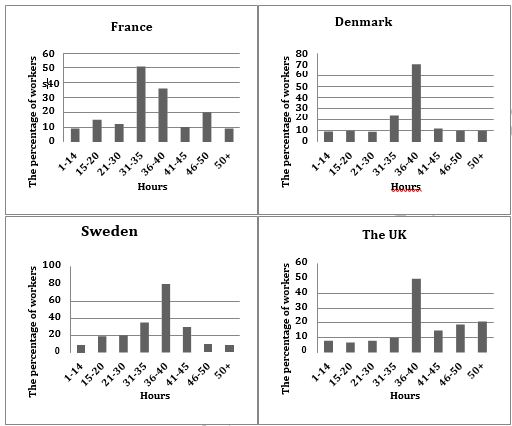
The charts below show the number of working hours per week, in industrial sector, in four European countries in 2002.
Summarize the information by selecting and reporting the main features and make comparisons with relevant.
Things you should know about Academic Writing Task 1:
- You are asked to describe information presented in graph/ table/ chart/ diagram.
- You have 20 minutes to finish the task and you have to write at least 150 words.
- If you are asked to use the information presented in the graph you must be careful not to copy it.
In Academic Writing task 1, candidates are assessed on their ability to:
- Organise, present and possibly compare data.
- Describe the stages of a process or procedure.
- Describe an object or event or sequence of events.
- Explain how something works.
Model Answer:-
The given column graphs compare the number of hours spent on work per week by industrial workers in France, Denmark, Sweden and the UK in 2002. In three countries, it can be seen that the maximum workers worked 36-40 hours, but in France the maximum workers worked 31-35 hours per week.
In France, approximately half the workers worked for 31-35 hours per week. The percentage of people who worked for 36-40 hours and 46-50 hours was 35% and 20% respectively. The figures for the rest of the working hours accounted for around 10% workers each.
Denmark and Sweden witnessed the highest proportion of people working for 36-40 hours, which was quite different from that of France. The second and the third place came from 31- 35 hours and 41-45 hours workers (25% and 10% in Denmark; 35% and 30% in Sweden). The proportion of people working for the remaining hours was higher in Denmark than in Sweden.
It is interesting to note that in the UK, the percentage of people working 50+ hours was the maximum. Almost 50% worked 36-40 hours per week.
Overall, France was a country where the people worked for the least hours, where as the Swedish people spent the most time on work among the people from four different countries.
More Bar Graph:
- The chart below shows the percentage of adults of different age groups in the UK who used the Internet everyday from 2003-2006.
- The chart below shows the expenditure on three categories among different age groups of residents in the UK in 2004.
- The chart below shows the percentage of whole world population in four countries from 1950 to 2000, with projections till 2050.
- The chart below shows the aid from six developed countries to developing countries from 2008-2010.

