IELTS Academic Writing Task 1
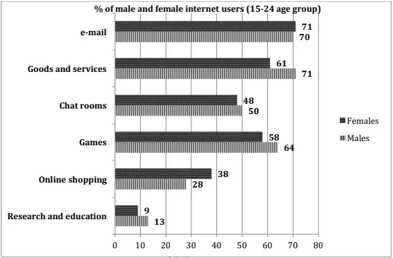
The graph below shows the way in which men and women used the Internet in Canada in 2000.
Summarise the information making comparisons where relevant.
Things you should know about Academic Writing Task 1:
- You are asked to describe information presented in graph/ table/ chart/ diagram.
- You have 20 minutes to finish the task and you have to write at least 150 words.
- If you are asked to use the information presented in the graph you must be careful not to copy it.
In Academic Writing task 1, candidates are assessed on their ability to:
- Organise, present and possibly compare data.
- Describe the stages of a process or procedure.
- Describe an object or event or sequence of events.
- Explain how something works.
Model Answer :
The given bar graph compares the percentage of males and females, of 15-24 age group, who used the Internet for various purposes in Canada in 2000. It is manifest from the graph that the least percentage of both genders used the Internet for research and education.
It is clear from the graph that the maximum number of men used the Internet for goods and services (71%). The second most popular use among the males was for sending e-mails (70%). A slightly higher percentage of women (71%) used the Internet for e-mails. However, a significantly lesser percentage (61%) of women used the Internet for goods and services.
Chat rooms were almost equally popular among both genders with 50% males and 48% females using the internet for this purpose respectively. Online shopping was more popular among women. 38% women used the net for this purpose and only 28% men used the Internet for online shopping.
Games were slightly more popular among males (64%) than females (58%). Research and education was the least popular activity among both men and women. 9% women and 13 % men used the Internet for this purpose.
Overall, it can be seen that women were ahead of men in using the internet for e-mailing and online shopping. In all other given activities, males superseded women.
More Bar Graph:
- The graphs below show four categories of citrus fruits and the top three countries to which these were exported (in thousand tonnes) in 2012.
- The graphs below show the average retirement age for men and women in 2004 and 2008 in six different countries.
- The graph below shows the percentage of dependents in 2000 and the predicted figures in 2050 in five countries, and also gives the world average.
- The chart shows the information relating to people within 15-minute drive service in a particular region in UK. It also compares the people living in urban areas and people living in rural areas.
- The graph below shows the result of a survey of young people in four European countries on the most effective solution of global warming.


