IELTS Academic Writing Task 1
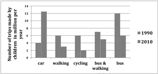
The graph below shows the number of trips made by children in one country to travel to and from school in 1990 and 2010 using various modes of transport.
Summarise the information by selecting and reporting the main features and make comparisons where relevant.
Things you should know about Academic Writing Task 1:
- You are asked to describe information presented in graph/ table/ chart/ diagram.
- You have 20 minutes to finish the task and you have to write at least 150 words.
- If you are asked to use the information presented in the graph you must be careful not to copy it.
In Academic Writing task 1, candidates are assessed on their ability to:
- Organise, present and possibly compare data.
- Describe the stages of a process or procedure.
- Describe an object or event or sequence of events.
- Explain how something works.
Model Answer :
The given column graph illustrates the number of trips made by children in two separate years, which are 1990 and 2010 in a particular country. The vertical axis represents the number of trips in million per year and the horizontal stands for the different modes of transport like bus, car, walking, bicycle and, bus and walking together.
In 1990, the trips made by bus were dramatically higher than by other modes. About 12 million trips were made by bus, which was two times more than those made by walking and cycling each, and three times more than those made by car. About 7 million trips were made by bus and walking together.
Two decades later, in 2010, the car trips superseded all other modes and became approximately 12.5 million, an increase of 8.5 million from the figures of 1990. The bus trips decreased to half and became 6 million. Trips made by bus and walking together also decreased by 1 million from the figures of 1990. Trips made on foot also decreased from 6 to 3 million and those made by cycling reduced to 2 million.
Overall, the column graph shows that bus was the most popular form of transport to go to and from school for children in 1990. However, in 2010, the car became the most popular mode.
More Bar Graph:
- The graph below shows the way in which men and women used the Internet in Canada in 2000.
- The graphs below show the average retirement age for men and women in 2004 and 2008 in six different countries.
- The graph below shows the percentage of dependents in 2000 and the predicted figures in 2050 in five countries, and also gives the world average.
- The chart shows the information relating to people within 15-minute drive service in a particular region in UK. It also compares the people living in urban areas and people living in rural areas.
- The graph below shows the result of a survey of young people in four European countries on the most effective solution of global warming.


