IELTS Academic Writing Task 1
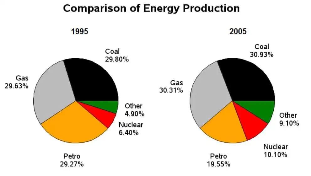
The pie charts show information about energy production in a country in two separate years.
Summarise the information by selecting and reporting the main features and make comparisons where relevant.
Things you should know about Academic Writing Task 1:
- You are asked to describe information presented in graph/ table/ chart/ diagram.
- You have 20 minutes to finish the task and you have to write at least 150 words.
- If you are asked to use the information presented in the graph you must be careful not to copy it.
In Academic Writing task 1, candidates are assessed on their ability to:
- Organise, present and possibly compare data.
- Describe the stages of a process or procedure.
- Describe an object or event or sequence of events.
- Explain how something works.
Model Answer
Pie charts show the distribution of different energy sources in 1995 and 2005.
Overall, it shows that the production of the two main energies (coal and gas) increased slightly, while gasoline production decreased significantly. Other and Nuclear also grew strongly but were less popular in both years.
In 1995, coal, gas, and petrol energy production was nearly equal, ranging from 29% to 30% each. By 2005, coal and gas figures had increased slightly (30.93% and 30.31% respectively), while petrol production had fallen to 19.55%.
In addition, the share of the remaining categories was significantly lower such as “other” at 4.9% for power generation at the beginning of the year and significantly higher for nuclear at 6.4%. By 2005, the ‘other’ share nearly doubled to 9.1 % as the use of nuclear power reached 10.1 % and increased more slowly.
Read More :
- The pie charts gives information about the world’s forests in five different regions
- The graph below shows the annual visitor spend for visitors to New Zealand from 5 countries for the years 1996 to 2014
- The Chart Shows Requests for Information at a Tourist Office in the United Kingdom
- The Town of Lynnfield in 1936 and then later in 2007
- The Maps below show Pancha Village in 2005 and 2015
- The diagram below describes the structure of a home smokery and how it works
- The bar chart illustrates the percentage of businesses in the UK who had a social media presence
The pie charts show information about energy production in a country in two separate years

Pie charts show the distribution of different energy sources in 1995 and 2005.
Overall, it shows that the production of the two main energies (coal and gas) increased slightly, while gasoline production decreased significantly. Other and Nuclear also grew strongly but were less popular in both years.
In 1995, coal, gas, and petrol energy production was nearly equal, ranging from 29% to 30% each. By 2005, coal and gas figures had increased slightly (30.93% and 30.31% respectively), while petrol production had fallen to 19.55%.
In addition, the share of the remaining categories was significantly lower such as “other” at 4.9% for power generation at the beginning of the year and significantly higher for nuclear at 6.4%. By 2005, the ‘other’ share nearly doubled to 9.1 % as the use of nuclear power reached 10.1 % and increased more slowly.


