IELTS Academic Writing Task 1
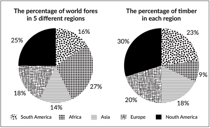
The pie charts gives information about the world’s forests in five different regions.
Summarise the information by selecting and reporting the main features and make comparisons where relevant.
Things you should know about Academic Writing Task 1:
- You are asked to describe information presented in graph/ table/ chart/ diagram.
- You have 20 minutes to finish the task and you have to write at least 150 words.
- If you are asked to use the information presented in the graph you must be careful not to copy it.
In Academic Writing task 1, candidates are assessed on their ability to:
- Organise, present and possibly compare data.
- Describe the stages of a process or procedure.
- Describe an object or event or sequence of events.
- Explain how something works.
Model Answer
A pie chart shows the share of global forests in five regions and the share of timber in each region.
Overall, It is noted that Africa as a whole has the largest forest area and Asia vice versa. North American forests have the highest percentage of wood, and African forests have the lowest percentage.
Starting with the first pie chart, Africa has the most significant forest cover at 27% of the world’s forests, followed by North America at 25%. Third on the list is Europe, with its greenbelt covering 18% of the world’s forests. South America ranks second from the bottom with just 16%, while Asia’s share is 2% lower than South America.
According to the second pie chart, most of the world’s timber comes from North American forests, accounting for 30% of the world’s total production. In contrast, Africa contributes only 9% of total world production. South America, Europe, and Asia are less than 25%, amounting to 23%, 20%, and 18%, respectively.
Read More :
- The graph below shows the annual visitor spend for visitors to New Zealand from 5 countries for the years 1996 to 2014
- The Chart Shows Requests for Information at a Tourist Office in the United Kingdom
- The Town of Lynnfield in 1936 and then later in 2007
- The Maps below show Pancha Village in 2005 and 2015
- The diagram below describes the structure of a home smokery and how it works
- The bar chart illustrates the percentage of businesses in the UK who had a social media presence
- The line chart below shows the changes that took place in three different areas of crime in New Port
The pie charts gives information about the world’s forests in five different regions

A pie chart shows the share of global forests in five regions and the share of timber in each region.
Overall, It is noted that Africa as a whole has the largest forest area and Asia vice versa. North American forests have the highest percentage of wood, and African forests have the lowest percentage.
Starting with the first pie chart, Africa has the most significant forest cover at 27% of the world’s forests, followed by North America at 25%. Third on the list is Europe, with its greenbelt covering 18% of the world’s forests. South America ranks second from the bottom with just 16%, while Asia’s share is 2% lower than South America.
According to the second pie chart, most of the world’s timber comes from North American forests, accounting for 30% of the world’s total production. In contrast, Africa contributes only 9% of total world production. South America, Europe, and Asia are less than 25%, amounting to 23%, 20%, and 18%, respectively.

