IELTS Academic Writing Task 1
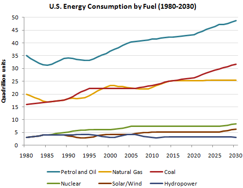
The graph below gives information from a 2008 report about consumption of energy in the USA since 1980 with projections until 2030.
Summarise the information by selecting and reporting the main features and make comparisons where relevant.
Things you should know about Academic Writing Task 1:
- You are asked to describe information presented in graph/ table/ chart/ diagram.
- You have 20 minutes to finish the task and you have to write at least 150 words.
- If you are asked to use the information presented in the graph you must be careful not to copy it.
In Academic Writing task 1, candidates are assessed on their ability to:
- Organise, present and possibly compare data.
- Describe the stages of a process or procedure.
- Describe an object or event or sequence of events.
- Explain how something works.
Model Answer
The given graph demonstrate data from a report in 2008 based on different forms of energy sources consumed in the USA from the year 1980 and also provide the prediction of this till 2030.
Overall, fossil fuels consumption in the USA is highest as compared to other energy sources.
To begin with petrol and oil; the consumption has steadily increased since the begging of the period. It started from 35 quadrillion units in 1980 and fluctuated from 1985 to 2005 in between the range of 33 to 36 quadrillion units. In 2010 the consumption reached at 40 units, and it is predicted that it crosses 45 quadrillion units by 2030. additionally, coal followed a similar trend started from 15 units and will have surpassed 30 quadrillion units by 2030.
Natural gas usage recorded 20 quadrillion units in 1980, and after some ups and downs it observed 22 quadrillion units in 2015, and it is expected that the amounts of units will remain to stagnate for last 15 years at around 24 quadrillions.
Furthermore with cleaner energy fuel sources, all of these began below than five quadrillion units, and all of these were slightly declined in 2000 before slightly increment recorded in Nuclear as six quadrillion units, five units recorded in solar/ wind in 2005 and it is expecting to remain same till the end. Hydropower’s consumption units recorded similarly in 2010 as in the first year and are projected to remain unchanged until 2030.
Read More bar graph :
- The line graph illustrates the total oil consumption of four different countries between 2009 and 2030
- The plans below show a public park when it first opened in 1920 and the same park today.
- The graph below shows radio and television audiences throughout the day in 1992
- The chart below shows the results of a survey about people’s coffee and tea buying and drinking habits in five Australian cities
- The graph shows Underground Station Passenger Numbers in London

