IELTS Academic Writing Task 1
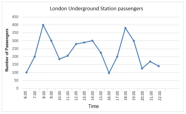
The graph shows Underground Station Passenger Numbers in London.
Summarise the information by selecting and reporting the main features and make comparisons where relevant.
Things you should know about Academic Writing Task 1:
- You are asked to describe information presented in graph/ table/ chart/ diagram.
- You have 20 minutes to finish the task and you have to write at least 150 words.
- If you are asked to use the information presented in the graph you must be careful not to copy it.
In Academic Writing task 1, candidates are assessed on their ability to:
- Organise, present and possibly compare data.
- Describe the stages of a process or procedure.
- Describe an object or event or sequence of events.
- Explain how something works.
Model Answer
The line graph depicts the number of passengers uses the underground station in London/ people at a London underground station over a day.
Overall, it can see that morning and evening time is the busiest time because of the highest number of people recorded at the underground station.
To begin with morning time, which is the busiest time of the day. One hundred people use the station at 06:00 am, but after that, there is a dramatic growth see between 06:00 and 08:00, with 400 people using the station at 8 o’clock. The numbers drop quickly at 10 o’clock amounting to below than 200. 11 am to 3 pm the number rises slightly and lies in the range between 250 to 300 people using the station.
Furthermore with afternoon, numbers touches its least point at 4 pm. There is then a rapid rise to a peak of 380 at 6 pm, but after 7 pm, numbers fall again, with only a slight increase again at 8 pm before declining by 3o people at 9 pm.
Read More bar graph :
- The graph below shows the cinema attendance of people on different days of the week in 2003, 2005 and 2007.
- The line graph illustrates the total oil consumption of four different countries between 2009 and 2030
- The plans below show a public park when it first opened in 1920 and the same park today.
- The graph below shows radio and television audiences throughout the day in 1992
- The chart below shows the results of a survey about people’s coffee and tea buying and drinking habits in five Australian cities
