IELTS Academic Writing Task 1
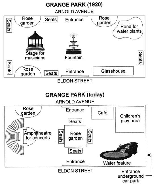
The plans below show a public park when it first opened in 1920 and the same park today.
Summarise the information by selecting and reporting the main features and make comparisons where relevant.
Things you should know about Academic Writing Task 1:
- You are asked to describe information presented in graph/ table/ chart/ diagram.
- You have 20 minutes to finish the task and you have to write at least 150 words.
- If you are asked to use the information presented in the graph you must be careful not to copy it.
In Academic Writing task 1, candidates are assessed on their ability to:
- Organise, present and possibly compare data.
- Describe the stages of a process or procedure.
- Describe an object or event or sequence of events.
- Explain how something works.
Model Answer
The given map illustrates the various changes which have taken place from 1920 to present in Green park.
Overall, it is apparent that the park has been dramatically transformed over the given period.
To begin with an old map, there were two entrance gates in the park one was in the north side on Arnold Avenue, and another was in south side Eldon Street, but now one new entrance is also constructed from the underground car park. There were many seats in every direction of the park. There was three rose garden there one was in the north-west, and one was on the south-west side but now only two gardens in the park.
Furthermore, the stage for musicians was located on the west side of the park, which was replaced by the Amphitheatre for concerts. A new rose garden constructed over the place of the fountain in the centre of the park and many seats surrounds it. Pond for water plants and glasshouse were replaced by children’s play area and water feature respectively.
Read More bar graph :
- The chart shows the information relating to people within 15-minute drive service in a particular region in UK. It also compares the people living in urban areas and people living in rural areas.
- The graph below shows the percentage of adults according to age and gender who do not do any physical activity in Australia.
- The chart below shows information about the challenges people face when they go to live in other countries.
- The graph below shows the cinema attendance of people on different days of the week in 2003, 2005 and 2007.
- The line graph illustrates the total oil consumption of four different countries between 2009 and 2030


