IELTS Academic Writing Task 1
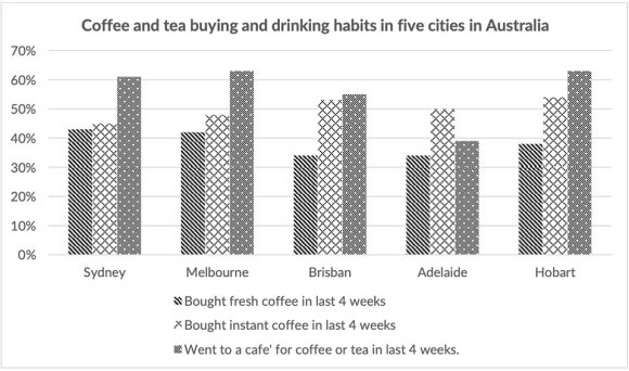
The chart below shows the results of a survey about people’s coffee and tea buying and drinking habits in five Australian cities.
Summarise the information by selecting and reporting the main features and make comparisons where relevant.
Things you should know about Academic Writing Task 1:
- You are asked to describe information presented in graph/ table/ chart/ diagram.
- You have 20 minutes to finish the task and you have to write at least 150 words.
- If you are asked to use the information presented in the graph you must be careful not to copy it.
In Academic Writing task 1, candidates are assessed on their ability to:
- Organise, present and possibly compare data.
- Describe the stages of a process or procedure.
- Describe an object or event or sequence of events.
- Explain how something works.
Model Answer
The given chart depicts the percentage of Australian who was consuming and purchasing tea and coffee in the last four weeks in five different cities of Australia named Sydney, Melbourne, Brisbane, Adelaide and Hobart.
Overall, it is apparent that the maximum proportion of people from Hobart were interested in to go to a cafe for tea and coffee and people prefer to buy instant coffee rather than fresh coffee in all cities.
To begin with Sydney and Melbourne, more than 60% of people of these cities went to café for coffee or tea. Almost 48% of citizens of Melbourne had a habit of buying instant coffee, which was about 5% more than Sydney’s people. Near about equal proportions of people of these cities liked to purchase fresh coffee amounting to 40%.
Moreover, with remaining cities, 50% to 53% of people from the three cities were interested in buying instant coffee, which was about 15% more than the proportion of people who bought fresh coffee in the same cities. At the same time, the largest proportion of Hobart’s people liked to go to cafe for coffee or tea, followed by Brisbane and Adelaide reported in 55% and 39% respectively.
Read More bar graph :
- The chart below shows information about the challenges people face when they go to live in other countries.
- The graph below shows the cinema attendance of people on different days of the week in 2003, 2005 and 2007.
- The line graph illustrates the total oil consumption of four different countries between 2009 and 2030
- The plans below show a public park when it first opened in 1920 and the same park today.
- The graph below shows radio and television audiences throughout the day in 1992


