IELTS Academic Writing Task 1
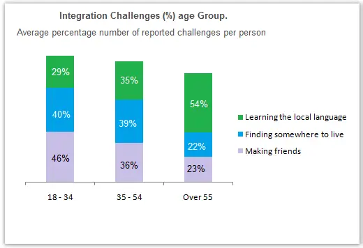
The chart below shows information about the challenges people face when they go to live in other countries.
Summarise the information making comparisons where relevant.
Things you should know about Academic Writing Task 1:
- You are asked to describe information presented in graph/ table/ chart/ diagram.
- You have 20 minutes to finish the task and you have to write at least 150 words.
- If you are asked to use the information presented in the graph you must be careful not to copy it.
In Academic Writing task 1, candidates are assessed on their ability to:
- Organise, present and possibly compare data.
- Describe the stages of a process or procedure.
- Describe an object or event or sequence of events.
- Explain how something works.
Model Answer :
The bar graph represents the challenges which people face when they start living in a new place in a different country, and the given data based on different age groups.
Overall, it is apparent that young people face difficulties in making friends while aged people face problems in learning the new language of the new country.
The chart presented three main problems/ common challenges that all age groups face are making friends, finding a place to live and learning the local language. The main challenge is making new friends that 18- 34aged group people mostly face in a new site, but it decreased by to% in next age group which is recorded as 36% and only 23% observed in over 55 age group.
Furthermore, finding somewhere to live, near about equal proportion is recorded in the first two age group people, but aged people face less difficulty in finding a new place for living. Moreover, youngster’s learn new things quickly as compare to old ones, so people from 18 to 54 learn, faceless problem to learn the local language of the new place as compared to people who are over 55 amounting to 29%, 35% and 54% respectively.
More Bar Graph:
- The graphs below show four categories of citrus fruits and the top three countries to which these were exported (in thousand tonnes) in 2012.
- The graphs below show the average retirement age for men and women in 2004 and 2008 in six different countries.
- The graph below shows the percentage of dependents in 2000 and the predicted figures in 2050 in five countries, and also gives the world average.
- The chart shows the information relating to people within 15-minute drive service in a particular region in UK. It also compares the people living in urban areas and people living in rural areas.
- The graph below shows the percentage of adults according to age and gender who do not do any physical activity in Australia.


