IELTS Academic Writing Task 1
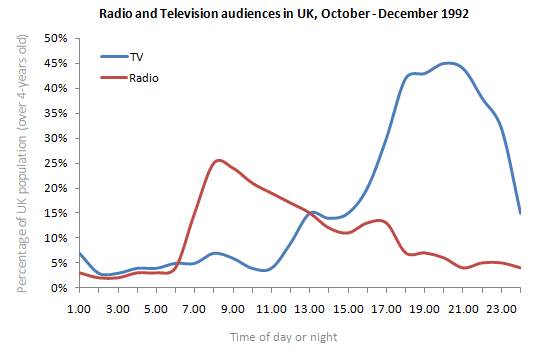
The graph below shows radio and television audiences throughout the day in 1992.
Summarise the information by selecting and reporting the main features and make comparisons where relevant.
Things you should know about Academic Writing Task 1:
- You are asked to describe information presented in graph/ table/ chart/ diagram.
- You have 20 minutes to finish the task and you have to write at least 150 words.
- If you are asked to use the information presented in the graph you must be careful not to copy it.
In Academic Writing task 1, candidates are assessed on their ability to:
- Organise, present and possibly compare data.
- Describe the stages of a process or procedure.
- Describe an object or event or sequence of events.
- Explain how something works.
Model Answer
The given chart depicts data of audiences who watch TV and listen to the radio throughout the day in the UK from October to December in the year 1992.
Overall, it is apparent that most of the UK people were interested in watching TV rather than Radio.
To begin with radio, about 5% of people who were over four years old watch TV and listened to the radio at 1:00 am. This percentage remained about unchanged until the next day at 5:30 am. During the period from 7:00 am to 9:00 am maximum proportion of UK people listened to the radio accounting for 25%, but the ratio decreased continuously after 9 am and recorded 6% at 11:00 pm.
Furthermore, with TV, the percentage fluctuated in between 7% to 10% from 1:00 am until 11:00 am. The proportion of the UK population followed the upward trend from noon and touched its peak point recorded as about 45% at 9:00 pm before dwindled to 15% at 11:00 pm.
Read More bar graph :
- The graph below shows the percentage of adults according to age and gender who do not do any physical activity in Australia.
- The chart below shows information about the challenges people face when they go to live in other countries.
- The graph below shows the cinema attendance of people on different days of the week in 2003, 2005 and 2007.
- The line graph illustrates the total oil consumption of four different countries between 2009 and 2030
- The plans below show a public park when it first opened in 1920 and the same park today.


