IELTS Academic Writing Task 1
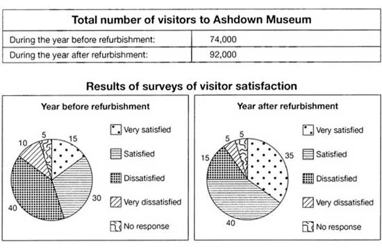
The table below shows the numbers of visitors to Ashdown Museum during the year before and the year after it was refurbished(renovate and redecorate (something, especially a building)). The charts show the result of surveys asking visitors how satisfied they were with their visit, during the same two periods.
Summarise the information by selecting and reporting the main features and make comparisons where relevant.
Things you should know about Academic Writing Task 1:
- You are asked to describe information presented in graph/ table/ chart/ diagram.
- You have 20 minutes to finish the task and you have to write at least 150 words.
- If you are asked to use the information presented in the graph you must be careful not to copy it.
In Academic Writing task 1, candidates are assessed on their ability to:
- Organise, present and possibly compare data.
- Describe the stages of a process or procedure.
- Describe an object or event or sequence of events.
- Explain how something works.
Model Answer
The table compares the figures of visitors who visit Ashdown museum before and after of museum renovation. Whereas chart depicts the visitor satisfaction’s surveys results.
Overall, it is apparent that refurbishment gives good results as there is a significant increase in annual visitor numbers and the ratio of very satisfied people.
Begin with the table, 74 000 people visited the museum in the final 12 months of its original condition means before renovation but This jumped by 18000 in the year following the improvements.
Furthermore, with a pie chart that describes visitor’s satisfaction in percentage. Before the refurbishment, about half of the visitors were dissatisfied, and 10% were very unhappy with the museum. 30 % of visitors were satisfied, almost double the proportion of the very satisfied people, and 5% of visitors did not respond.
Coming to year after refurbishment, the ratio of very satisfied and satisfied people increased by 20% and 10% respectively whereas the proportion of the dissatisfied people dwindled to 15%. Only 5% of visitors are very dissatisfied with the museum that is equivalent to the ratio of those people who don’t participate in the survey.
Read More :
- The pie charts show the electricity generated in Germany and France from all sources and renewable
- The chart shows the unemployment situation in Australia in the year 2012
- The table below gives information about UK independent films
- The chart below shows information about changes in average house prices
- The table below shows top ten countries with largest population in 2019, and how it is projected to change by 2100
The table below shows the numbers of visitors to Ashdown Museum

The table compares the figures of visitors who visit Ashdown museum before and after of museum renovation. Whereas chart depicts the visitor satisfaction’s surveys results.
Overall, it is apparent that refurbishment gives good results as there is a significant increase in annual visitor numbers and the ratio of very satisfied people.
Begin with the table, 74 000 people visited the museum in the final 12 months of its original condition means before renovation but This jumped by 18000 in the year following the improvements.
Furthermore, with a pie chart that describes visitor’s satisfaction in percentage. Before the refurbishment, about half of the visitors were dissatisfied, and 10% were very unhappy with the museum. 30 % of visitors were satisfied, almost double the proportion of the very satisfied people, and 5% of visitors did not respond.
Coming to year after refurbishment, the ratio of very satisfied and satisfied people increased by 20% and 10% respectively whereas the proportion of the dissatisfied people dwindled to 15%. Only 5% of visitors are very dissatisfied with the museum that is equivalent to the ratio of those people who don’t participate in the survey.
