IELTS Academic Writing Task 1
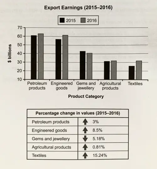
The chart below shows the value of one country’s exports in various categories during 2015 and 2016. The table shows the percentage change in each category or exports in 2016 compared with 2015.
Summarise the information making comparisons where relevant.
Things you should know about Academic Writing Task 1:
- You are asked to describe information presented in graph/ table/ chart/ diagram.
- You have 20 minutes to finish the task and you have to write at least 150 words.
- If you are asked to use the information presented in the graph you must be careful not to copy it.
In Academic Writing task 1, candidates are assessed on their ability to:
- Organise, present and possibly compare data.
- Describe the stages of a process or procedure.
- Describe an object or event or sequence of events.
- Explain how something works.
Model Answer :
The given figures illustrate about a nation’s export earning in five categories in 2015 and 2016.
Overall, it is noticeable that according to bar chart revenues in all categories except gems and jewellery increased in the given period while the table shows that the most significant growth in textile industries.
To begin with the bar chart, export earning from petroleum products recorded as $61 billion which was about double of agricultural products and textile in 2015 and they followed the same trend in 2016 amounting for $63billion which was an increased of 3%, 32 billion dollars and textile industries with 32billion dollars which increased export income by 15.24 % respectively.
Furthermore, Earning from engineered goods inclined to $61 billion in 2016 from $58 billion in 2015 and income from these goods went up by 8.5%. Finally, the only decline in revenue occurred in the gems and jewellery products group, where export earnings dropped by 5% to approximately $40 billion in 2016.
Read more related post :
- The chart below shows information about the challenges people face when they go to live in other countries
- The table below shows the salaries of secondary/high school teachers in 2009
- The charts below show the average percentages in typical meals of three types of nutrients all of which may be unhealthy if eaten too much
- The graphs indicate the source of complaints about the bank of America and the amount of time it takes to have the complaints resolved.
- The graph below shows the consumption of fish and different kinds of meat in a European country between 1979 and 2004.


