IELTS Academic Writing Task 1
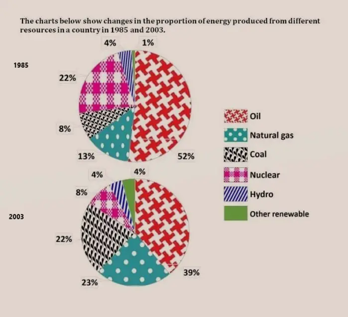
The chart below show changes in the proportion of energy produced from different resources in a country in 1985 and 2003
Summarise the information by selecting and reporting the main features and make comparisons where relevant.
Things you should know about Academic Writing Task 1:
- You are asked to describe information presented in graph/ table/ chart/ diagram.
- You have 20 minutes to finish the task and you have to write at least 150 words.
- If you are asked to use the information presented in the graph you must be careful not to copy it.
In Academic Writing task 1, candidates are assessed on their ability to:
- Organise, present and possibly compare data.
- Describe the stages of a process or procedure.
- Describe an object or event or sequence of events.
- Explain how something works.
Model Answer
The pie chart shows six different resources used to produce energy in 1985 and 2003.
Overall, it is clear that most of the energy comes from primary oil, followed by nuclear power, natural gas, coal, nuclear power and other renewable energies. Over time, renewable energies have become somewhat use has declined, but still, primarily oil, coal and natural gas are used to produce the largest proportions of energy. it was done.
In 1985, a large amount of oil was used to generate electricity at 52%, but by 2003 that number had dropped to 39%. Nuclear power, the second-largest resource in 1985, showed the sharpest (largest) decline in 2003 from 22% to just 8%. In contrast, natural gas rose by 10% and reached 23% in 2003, and coal almost tripled to 22%.
Furthermore, In terms of cleaner energy sources, there was no change in hydropower, which represented 4% of total usage in both years while other renewable quadrupled(four times) from 1% in 1985 to 4% in 2003.
Read More :
- The table and pie chart illustrate populations in Australia, according to different nationalities
- The maps below show Pancha Village in 2005 and 2015
- The average spending on shopping on the internet per person
- The line chart shows average attendance at the cinema among various age groups in the US from 2000
- The graph below shows that, the percentage of Australian exports to 4 countries from 1990 to 2012
The chart below show changes in the proportion of energy produced from different resources in a country in 1985 and 2003

The pie chart shows six different resources used to produce energy in 1985 and 2003.
Overall, it is clear that most of the energy comes from primary oil, followed by nuclear power, natural gas, coal, nuclear power and other renewable energies. Over time, renewable energies have become somewhat use has declined, but still, primarily oil, coal and natural gas are used to produce the largest proportions of energy. it was done.
In 1985, a large amount of oil was used to generate electricity at 52%, but by 2003 that number had dropped to 39%. Nuclear power, the second-largest resource in 1985, showed the sharpest (largest) decline in 2003 from 22% to just 8%. In contrast, natural gas rose by 10% and reached 23% in 2003, and coal almost tripled to 22%.
Furthermore, In terms of cleaner energy sources, there was no change in hydropower, which represented 4% of total usage in both years while other renewable quadrupled(four times) from 1% in 1985 to 4% in 2003.


