IELTS Academic Writing Task 1
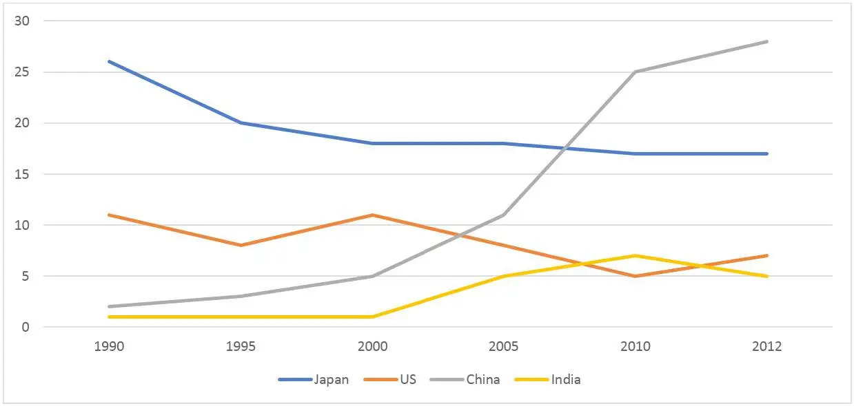
The graph below shows that, the percentage of Australian exports to 4 countries from 1990 to 2012.
Summarise the information by selecting and reporting the main features and make comparisons where relevant.
Things you should know about Academic Writing Task 1:
- You are asked to describe information presented in graph/ table/ chart/ diagram.
- You have 20 minutes to finish the task and you have to write at least 150 words.
- If you are asked to use the information presented in the graph you must be careful not to copy it.
In Academic Writing task 1, candidates are assessed on their ability to:
- Organise, present and possibly compare data.
- Describe the stages of a process or procedure.
- Describe an object or event or sequence of events.
- Explain how something works.
Model Answer
The line graph shows Australia’s exports to Japan, the United States, China and India from 1990 to 2012.
Overall, it is easy to see that total exports to India and China are increasing, while exports from the United States and Japan are declining. At the end of the period, China had the highest exports, followed by other countries.
Japan’s figure was significantly higher than other countries in 1990, exceeding $26 billion, but then plummeted to about $20 billion over the next five years to nearly $17 billion by 2012. It was on a downward trend. In contrast, China’s exports in 1990 were only $3 billion, but that number was steadily increasing. Numbers have changed drastically since 2000, was reached $28 billion in 2012.
US data fluctuated around $10 billion in between 1990 and 2000, then declined to $5 billion, but recovered slightly and the study period ended at $6 billion. Did. Similarly, India’s exports began at $1 billion in 1990, stagnated for the first decade, and overtook the United States at $7 billion in 2010, then ended slightly lower than the United States.
Read More :
- The maps below shows the town of Lynnfield in 1936 and then later in 2007
- The chart shows the proportion of people in a UK survey carried out in three different years
- The diagram details the process of making leather products
- The chart below shows how much money is spent in the budget on different sectors by the UAE
- The diagram details the process of making clothes from plastic bottles
- The chart below shows the average daily minimum and maximum level of two air pollutants
The graph below shows that, the percentage of Australian exports to 4 countries from 1990 to 2012

The line graph shows Australia’s exports to Japan, the United States, China and India from 1990 to 2012.
Overall, it is easy to see that total exports to India and China are increasing, while exports from the United States and Japan are declining. At the end of the period, China had the highest exports, followed by other countries.
Japan’s figure was significantly higher than other countries in 1990, exceeding $26 billion, but then plummeted to about $20 billion over the next five years to nearly $17 billion by 2012. It was on a downward trend. In contrast, China’s exports in 1990 were only $3 billion, but that number was steadily increasing. Numbers have changed drastically since 2000, was reached $28 billion in 2012.
US data fluctuated around $10 billion in between 1990 and 2000, then declined to $5 billion, but recovered slightly and the study period ended at $6 billion. Did. Similarly, India’s exports began at $1 billion in 1990, stagnated for the first decade, and overtook the United States at $7 billion in 2010, then ended slightly lower than the United States.
