IELTS Academic Writing Task 1
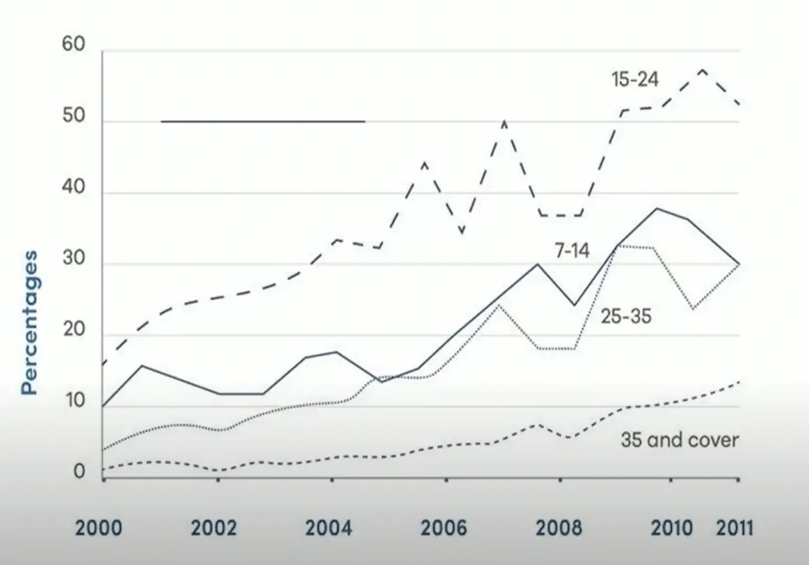
The line chart shows average attendance at the cinema among various age groups in the US from 2000.
Summarise the information by selecting and reporting the main features and make comparisons where relevant.
Things you should know about Academic Writing Task 1:
- You are asked to describe information presented in graph/ table/ chart/ diagram.
- You have 20 minutes to finish the task and you have to write at least 150 words.
- If you are asked to use the information presented in the graph you must be careful not to copy it.
In Academic Writing task 1, candidates are assessed on their ability to:
- Organise, present and possibly compare data.
- Describe the stages of a process or procedure.
- Describe an object or event or sequence of events.
- Explain how something works.
Model Answer
Line graphs show data on the number of people according to their age who went to US cinemas between 2000 and 2011.
Overall admission increased in all groups, with young people, especially teens and young adults, watched the movie most. Older people went to the cinema less often.
Fifteen per cent of the people in the group aged 15 to 24 were started going to the cinema, slightly more than in other age groups. The number, which then steadily increased to more than 30% by 2004, fluctuated between 35% and 50% over the next 2 to 3 years before ending at 52%. However, although the participation of people aged 35 and over was small, it increased steadily, started at 1% and peaked at 13% at the end of the term.
The patterns for 7-14 and 25-35-year-old cinema-goers(people going to the cinema) were almost the same the whole time as the former began twice as high/double at 10%. Attendance was then erratic/unstable until 2005 from 2006 there was an increased a lot to 30%, followed by a high of 38% in 2010 and a final figure of 30% in 2011. The second group showed an unstable trend with comparable percentages, intersected with the 7-14 years age group twice, and concluded the period with a partial recovery to an identical 3096 figure.
Read More :
- The graph below shows that, the percentage of Australian exports to 4 countries from 1990 to 2012
- The maps below shows the town of Lynnfield in 1936 and then later in 2007
- The chart shows the proportion of people in a UK survey carried out in three different years
- The diagram details the process of making leather products
- The chart below shows how much money is spent in the budget on different sectors by the UAE
- The diagram details the process of making clothes from plastic bottles
The line chart shows average attendance at the cinema among various age groups in the US from 2000

Line graphs show data on the number of people according to their age who went to US cinemas between 2000 and 2011.
Overall admission increased in all groups, with young people, especially teens and young adults, watched the movie most. Older people went to the cinema less often.
Fifteen per cent of the people in the group aged 15 to 24 were started going to the cinema, slightly more than in other age groups. The number, which then steadily increased to more than 30% by 2004, fluctuated between 35% and 50% over the next 2 to 3 years before ending at 52%. However, although the participation of people aged 35 and over was small, it increased steadily, started at 1% and peaked at 13% at the end of the term.
The patterns for 7-14 and 25-35-year-old cinema-goers(people going to the cinema) were almost the same the whole time as the former began twice as high/double at 10%. Attendance was then erratic/unstable until 2005 from 2006 there was an increased a lot to 30%, followed by a high of 38% in 2010 and a final figure of 30% in 2011. The second group showed an unstable trend with comparable percentages, intersected with the 7-14 years age group twice, and concluded the period with a partial recovery to an identical 3096 figure.

