IELTS Academic Writing Task 1
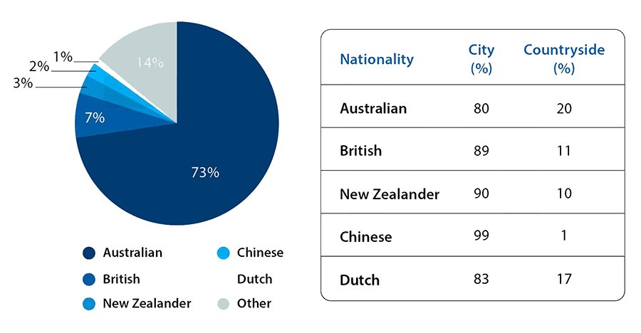
The table and pie chart illustrate populations in Australia, according to different nationalities.
Summarise the information by selecting and reporting the main features and make comparisons where relevant.
Things you should know about Academic Writing Task 1:
- You are asked to describe information presented in graph/ table/ chart/ diagram.
- You have 20 minutes to finish the task and you have to write at least 150 words.
- If you are asked to use the information presented in the graph you must be careful not to copy it.
In Academic Writing task 1, candidates are assessed on their ability to:
- Organise, present and possibly compare data.
- Describe the stages of a process or procedure.
- Describe an object or event or sequence of events.
- Explain how something works.
Model Answer
Pie charts and tables show the number of people living in Australia and also show that residents tend to live in rural or urban areas.
Overall, it appears that the majority of the population is Australian, followed by many other nationals and Britons, and smaller numbers of New Zealanders, Chinese and Dutch. All groups of people mostly live in cities, especially individuals from China.
The pie chart describes that 73% of the Australian population includes Australians. This number is followed by others by 14%, which is double the residents from England recorded at 7%, New Zealand at 3%, Chinese at 2% and Dutch people (Netherlands) only 1%.
Furthermore, with the table, Australians are most likely to live outside of cities, although 80% still live in an urban (city) environment. Similarly, 83% of Dutch people live in cities and 17% in the countryside. UK and New Zealand residents have roughly the same proportions with around 90% in the cities. Finally, the Chinese mainly live in cities (99%). In contrast, only 1% of Chinese live in the countryside while 11% of British and 11% of New Zealanders prefer to live in the countryside
Read More :
- The maps below show Pancha Village in 2005 and 2015
- The average spending on shopping on the internet per person
- The line chart shows average attendance at the cinema among various age groups in the US from 2000
- The graph below shows that, the percentage of Australian exports to 4 countries from 1990 to 2012
- The maps below shows the town of Lynnfield in 1936 and then later in 2007
The table and pie chart illustrate populations in Australia, according to different nationalities

Pie charts and tables show the number of people living in Australia and also show that residents tend to live in rural or urban areas.
Overall, it appears that the majority of the population is Australian, followed by many other nationals and Britons, and smaller numbers of New Zealanders, Chinese and Dutch. All groups of people mostly live in cities, especially individuals from China.
The pie chart describes that 73% of the Australian population includes Australians. This number is followed by others by 14%, which is double the residents from England recorded at 7%, New Zealand at 3%, Chinese at 2% and Dutch people (Netherlands) only 1%.
Furthermore, with the table, Australians are most likely to live outside of cities, although 80% still live in an urban (city) environment. Similarly, 83% of Dutch people live in cities and 17% in the countryside. UK and New Zealand residents have roughly the same proportions with around 90% in the cities. Finally, the Chinese mainly live in cities (99%). In contrast, only 1% of Chinese live in the countryside while 11% of British and 11% of New Zealanders prefer to live in the countryside


