IELTS Academic Writing Task 1
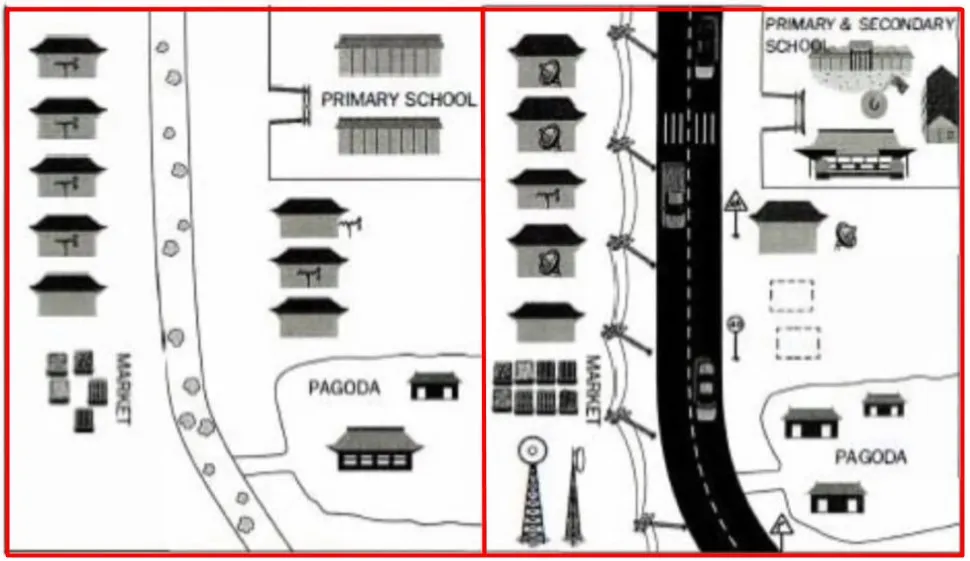
The maps below show Pancha Village in 2005 and 2015.
Summarise the information by selecting and reporting the main features and make comparisons where relevant.
Things you should know about Academic Writing Task 1:
- You are asked to describe information presented in graph/ table/ chart/ diagram.
- You have 20 minutes to finish the task and you have to write at least 150 words.
- If you are asked to use the information presented in the graph you must be careful not to copy it.
In Academic Writing task 1, candidates are assessed on their ability to:
- Organise, present and possibly compare data.
- Describe the stages of a process or procedure.
- Describe an object or event or sequence of events.
- Explain how something works.
Model Answer
The maps illustrate changes to the village of Pancha from 2005 to 2015.
Overall, it is apparent that the town became more developed(became better) with the addition of new facilities and constructions such as roads, modern utilities, and general expansion of current residential, commercial and educational areas.
By 2015, the single dirt road present in 2005 had been converted into a highway lined with road signs, telephone poles(where telephone lines are hung up) and telecommunication towers(used to connect phones) in the bottom left corner (south-west)of the map. On the left side of the road, the marketplace had grown (got bigger) and become more organized, while tne sizes of me homes along the road had also become bigger.
To the right side(southeast) of the road, in the bottom corner, the area demarcated for pagodas(temples) now allows for an additional building. Just above the pagodas, two homes have been removed and in the upper right corner, the town built a secondary school to complete the primary school. It is noticeable that in 2005, most homes only possessed access to telephones but by 2015 satellite service (uses satellites to provide internet, TV shows) had become common.
Read More :
- The average spending on shopping on the internet per person
- The line chart shows average attendance at the cinema among various age groups in the US from 2000
- The graph below shows that, the percentage of Australian exports to 4 countries from 1990 to 2012
- The maps below shows the town of Lynnfield in 1936 and then later in 2007
- The chart shows the proportion of people in a UK survey carried out in three different years
- The diagram details the process of making leather products
The maps below show Pancha Village in 2005 and 2015

The maps illustrate changes to the village of Pancha from 2005 to 2015.
Overall, it is apparent that the town became more developed(became better) with the addition of new facilities and constructions such as roads, modern utilities, and general expansion of current residential, commercial and educational areas.
By 2015, the single dirt road present in 2005 had been converted into a highway lined with road signs, telephone poles(where telephone lines are hung up) and telecommunication towers(used to connect phones) in the bottom left corner (south-west)of the map. On the left side of the road, the marketplace had grown (got bigger) and become more organized, while tne sizes of me homes along the road had also become bigger.
“To the right side(southeast) of the road, in the bottom corner, the area demarcated for pagodas(temples) now allows for an additional building. Just above the pagodas, two homes have been removed and in the upper right corner, the town built a secondary school to complete the primary school. It is noticeable that in 2005, most homes only possessed access to telephones but by 2015 satellite service (uses satellites to provide internet, TV shows) had become common.”


