IELTS Academic Writing Task 1
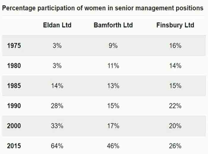
The table below shows the percentage participation of women in senior management in three companies between 1975 and 2015.
Summarise the information by selecting and reporting the main features and make comparisons where relevant.
Things you should know about Academic Writing Task 1:
- You are asked to describe information presented in graph/ table/ chart/ diagram.
- You have 20 minutes to finish the task and you have to write at least 150 words.
- If you are asked to use the information presented in the graph you must be careful not to copy it.
In Academic Writing task 1, candidates are assessed on their ability to:
- Organise, present and possibly compare data.
- Describe the stages of a process or procedure.
- Describe an object or event or sequence of events.
- Explain how something works.
Model Answer
The table depicts the percentage of women who participated in senior management positions in three companies over 40 years from 1975 to 2015.
Overall, it is apparent that the number of women working as a senior manager level in Eldan and Bamforth LTD companies is increasing throughout the given time. In contrast, the Finsbury LTD percentage was changing every five years.
In the year 1975 more women were in senior positions at Finsbury Ltd than the other two companies amounting to 16%, but the percentage drop of 14% after five years, followed by a rise of 1% five years later. In 1990, women’s percentage was increased by 7% but again the rate drop back to 20% in 2000. After 15 years, 26% of top posts were filled by women.
Furthermore, Eldan and Bamforth are two companies who display a steady increasing trend from the beginning of the period till 2015. There was no change saw in Eldan LTD data in the first five years it was accounting for 3%. Then after five years, the percentage inclined more than threefold and consistently rose in the final year, who made up the highest percentage of 64% that was far more as compared to other companies. Similarly, Bamforth LTD got 9% in the starting years and gradually increased with an average of 2% in each subsequent period until 2000. However, in 2015 the proportion rose by 29% and recorded as 46%.
Read More :
- The chart compares the number of people per household by percentage in the UK in 1981 and 2001
- The diagrams below give information about the manufacture of frozen fish pies
- The graph below shows the percentage of people in different age groups in one city
- The chart below shows the global sales (in billions of dollars) of different kinds of digital games
- The pie chart shows the online sales for retail sectors in Canada
