IELTS Academic Writing Task 1
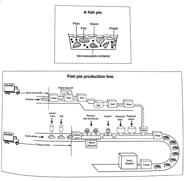
The diagrams below give information about the manufacture of frozen fish pies.
Summarise the information by selecting and reporting the main features and make comparisons where relevant.
Things you should know about Academic Writing Task 1:
- You are asked to describe information presented in graph/ table/ chart/ diagram.
- You have 20 minutes to finish the task and you have to write at least 150 words.
- If you are asked to use the information presented in the graph you must be careful not to copy it.
In Academic Writing task 1, candidates are assessed on their ability to:
- Organise, present and possibly compare data.
- Describe the stages of a process or procedure.
- Describe an object or event or sequence of events.
- Explain how something works.
Model Answer
The given picture illustrates the various steps involved in the commercial production of frozen fish pies.
Overall, it is apparent that four ingredients are used such as fresh salmon(a large edible fish), peas, Sauce and potatoes. The preparation process is separate for each ingredient.
To begin with potatoes, The potatoes are delivered to the factory up to a month in advance. Potatoes are cleaned, peeled and sliced respectively. These slices go through boiling and chilling stage before storing for the pie preparation. Turning to the fish preparation, it takes more time than the preparation of potatoes. Fish delivered to the factory within 12 hours. Lemon juice and salt are added to these slices before they are steamed in the oven. In the next step, skin and bones removed by hands. All the material go through the visual inspection step.
Peas and Sauce are needed for the pie preparation. Pies are collected in microwaveable containers. Peas and Sauce that are prepared added to the fish, and then the pie is covered with cooked potato slices. The pies are wrapped manually and are frozen before they are either stored or dispatched.
Read More :
- The graph below shows radio and television audiences throughout the day in 1992
- The chart below shows the results of a survey about people’s coffee and tea buying and drinking habits in five Australian cities
- The graph shows Underground Station Passenger Numbers in London
- the charts below show the main methods of transportation for people travelling to one university for work or study in 2004 and 2009
- The chart compares the number of people per household by percentage in the UK in 1981 and 2001


