IELTS Academic Writing Task 1
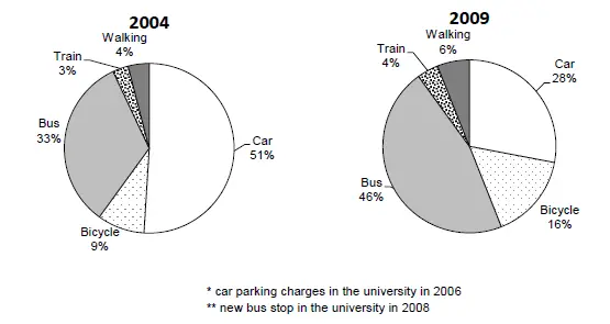
the charts below show the main methods of transportation for people travelling to one university for work or study in 2004 and 2009.
Summarise the information by selecting and reporting the main features and make comparisons where relevant.
Things you should know about Academic Writing Task 1:
- You are asked to describe information presented in graph/ table/ chart/ diagram.
- You have 20 minutes to finish the task and you have to write at least 150 words.
- If you are asked to use the information presented in the graph you must be careful not to copy it.
In Academic Writing task 1, candidates are assessed on their ability to:
- Organise, present and possibly compare data.
- Describe the stages of a process or procedure.
- Describe an object or event or sequence of events.
- Explain how something works.
Model Answer
The given figures depict the proportion of travellers using five traffic methods to travel to university where they do work or study in 2004 and 2009.
Overall, it is apparent that the ratio of people travelling by cars significantly decreased from the first year to last year while other modes of transportation marked an upward trend.
In 2004 over half of the people travel by car which followed by bus recorded as 33%. Only 9% of people like to use a bicycle to commute to university, which was about three times the proportion of travellers who use the train for travelling. 4% of people prefer to walk to go to university.
Furthermore with 2009, the percentage of bus-based travellers rose by n%. The trend of preferring buses rather than cars increased because of introducing a new bus stop in the year 2006 and alterations to the car park at university in 2008, so that’s why ratio of car travellers dwindled to 28%. The percentage of bicycle rider also increased by 7%. Train passengers and pedestrians percentage also followed the upward pattern and amounting to 4% and 6% respectively.
Read More bar graph :
- The plans below show a public park when it first opened in 1920 and the same park today.
- The graph below shows radio and television audiences throughout the day in 1992
- The chart below shows the results of a survey about people’s coffee and tea buying and drinking habits in five Australian cities
- The graph shows Underground Station Passenger Numbers in London
- The graph below gives information from a 2008 report about consumption of energy in the USA since 1980 with projections until 2030


