IELTS Academic Writing Task 1
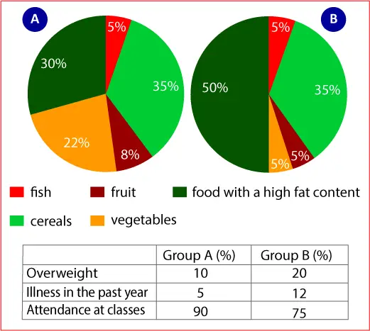
The charts below give information about the diet and general health of two groups of students.
Summarise the information by selecting and reporting the main features and make comparisons where relevant.
Things you should know about Academic Writing Task 1:
- You are asked to describe information presented in graph/ table/ chart/ diagram.
- You have 20 minutes to finish the task and you have to write at least 150 words.
- If you are asked to use the information presented in the graph you must be careful not to copy it.
In Academic Writing task 1, candidates are assessed on their ability to:
- Organise, present and possibly compare data.
- Describe the stages of a process or procedure.
- Describe an object or event or sequence of events.
- Explain how something works.
Model Answer
The chart illustrates the data of two student groups that present their diet and their general health.
Overall, it is apparent that eating habits have a direct connection with health. So, food with fat content is the most significant cause of the overweight problem and less class attendance.
To begin with a pie chart, it presents the data of two student groups, group A and group B. in group A, the cereals obtain the highest amount of 35% that is 5% more than the food with a high content of fat. In addition, while the proportion of vegetables in the diet is 22%, out students take less than 10% fruit and fish in their diet. In comparison, in group B, whereas the percentage of cereals s-ay unchanged at 35%, half of the proportion is acquired by food with high-fat content. Interestingly, students take the same rate of fish, fruit, and vegetable in their diet.
On the other hand, the table shows that group A students are healthier than the students in group B due to these food habits. The rate of group B’s overweight students is 20% that is double the of group A. Students who had an illness in the past year in group A is 5%, which is less than the figure in group B with 7%. Moreover, the diet also affects class attendance. Attendance of students in group A reaches 90%, and the percentage in group B is only 75%.
Read More :
- The chart below shows the global sales (in billions of dollars) of different kinds of digital games
- The pie chart shows the online sales for retail sectors in Canada
- The table below shows the percentage participation of women in senior management
- The chart below shows information about changes in average house prices
- The table below shows top ten countries with largest population in 2019, and how it is projected to change by 2100


