IELTS Academic Writing Task 1
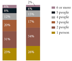
The chart compares the number of people per household by percentage in the UK in 1981 and 2001.
Summarise the information by selecting and reporting the main features and make comparisons where relevant.
Things you should know about Academic Writing Task 1:
- You are asked to describe information presented in graph/ table/ chart/ diagram.
- You have 20 minutes to finish the task and you have to write at least 150 words.
- If you are asked to use the information presented in the graph you must be careful not to copy it.
In Academic Writing task 1, candidates are assessed on their ability to:
- Organise, present and possibly compare data.
- Describe the stages of a process or procedure.
- Describe an object or event or sequence of events.
- Explain how something works.
Model Answer
The given figure depicts the percentages for the number of people living in households over a period of twenty years from 1981 to 2001 in the UK.
Overall, it is apparent that home with more people declined because the maximum proportion of people want to live alone in the house or two people in the home.
To begin with 1 and 2 person household. 23% and 31% of people want to live in 1 person and two-person home respectively in 1981, and both were increased by 3% in 2001. Three people house follow the opposite trend recorded 20% in 1981 but dwindled to 17% in 2001
Furthermore with four people homes. The percentage inclined by 3% and amounting to 15% in 2001. moreover, five people households and six or more people home follow similar trend both were reported to 6% and 2% in 2001 from 8% and 6% in 1981 in the sequence.
Read More bar graph :
- The plans below show a public park when it first opened in 1920 and the same park today.
- The graph below shows radio and television audiences throughout the day in 1992
- The chart below shows the results of a survey about people’s coffee and tea buying and drinking habits in five Australian cities
- The graph shows Underground Station Passenger Numbers in London
- the charts below show the main methods of transportation for people travelling to one university for work or study in 2004 and 2009


